8 STEPS TO SUCCESS FOR FEARLESS PAINTING
Learning how to paint with watercolors or acrylics is a journey. Painting, like going on a journey has hills of challenges and valleys of easy travel. Successful artists devise a road map of simplified steps that lead to an adventure with paint and creative thought.
In my "Fearless Painting" classes, I aim to
assist my students as they travel a colorful road of painterly discoveries. In
my programs we practice techniques, study the artwork of talented masters and
share ideas about how to express who we are as artists. All with the purpose of learning how to successfully paint something we like.
In one of my recent classes, my students
and I were inspired by a photo that I had taken many years ago of a Foss tug
boat moving logs on lake Coeur D’Alene, ID.
Our goal was to create a painting that captured the essence of the scene based upon my student's interpretations of the class’s
inspiration.
To help my students I have developed a program to assist them in their journey and I call it the "8 steps to success for Fearless Painting!"
Enter the 8 steps to success for painting the Foss Tug!
In using these steps to success, my students and I first learn how to "see" our inspiration with new eyes and utilize our own creativity while we paint artwork that is fun to do! Following is the story behind the methods that I used to fearlessly paint the tug boat in the photo shown. I hope that these steps help you to better understand how you can paint successfully, simply by planning out your visual "road trip" to a successful painting.
 |
| My photo of the tug boat. |

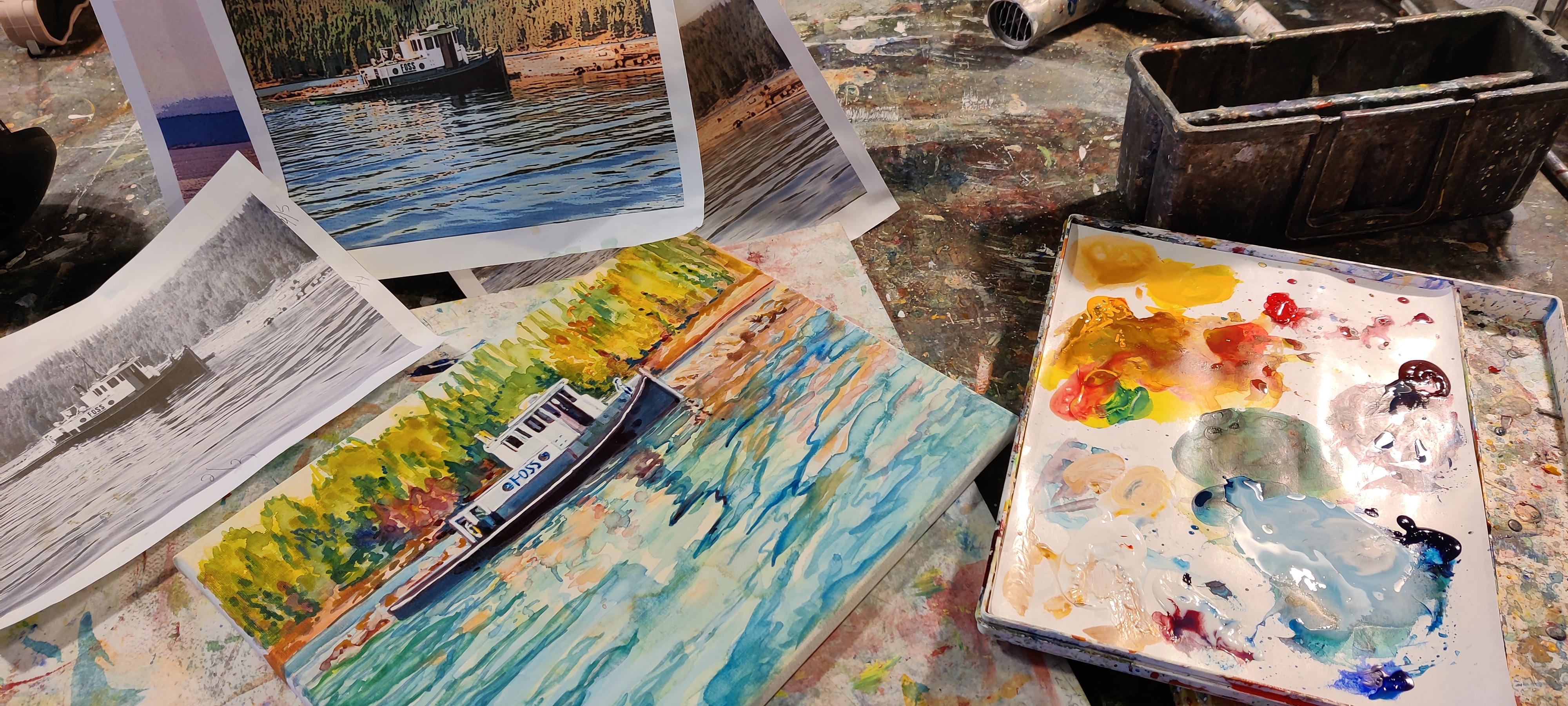
What is a value study? It is a black and white image that gives me information. I can make this study a drawing using my pencils or I can turn a color photo into a "value study" simply by printing the photo in black and white. Once I have a black and white image/print, I look to "see" a range of lights to darks though out the composition. I, then, create a very simplified line drawing copying the contours of what I see & feel is important in my inspiration.

STEP 2:
I make notes as to the locations of the light to middle gray values and the rich, shadow darks by filling in my line drawing with a pen or pencil in order to create a range of simplified value shapes. This step helps me make better choices once I begin the painting process.

STEP 3:
It is now time to pull out a piece of watercolor paper or a canvas. Your choice, what do you like to paint on? I am going to paint this image on a 11 x 14 canvas. Since, I am making the choice to create a painting that is representational I need spend some time drawing a fairly accurate image on my canvas. When drafting the "road map" of my composition, I need to keep in mind the relative sizes of one object ( such as the boat) to another ( such as the space delineated in the background) . I also need to remember and draw in the important details ( such as portholes and doors on boat). Including these small details make the subject matter interesting and lend believability to my painting.
STEP 4:
Step four is based upon one simple word “CHOICE”! As artists, we have to make choices because when we paint , we are in charge of our own visual creation.
Question #1: What styles of painting or techniques do you , as the artist, like and want to use, in order to create your own unique visual statement?
Artist’s over the years have developed many different “styles” in painting. An artist can be realistic, impressionistic or even abstract an image. One can create a mono-chromatic painting based upon a value study. One can play with brush strokes to design a painting that is reminiscent of an impressionists such as the American: John Henry Twatchman.
 |
| John Henry Twatchman _ "Gloucester boats" 1902 oil |
An artist can also simplify their designs. By stepping away from the realism in our inspiration we can create a painting that is abstracted but still reminiscent of our inspiration. Consider what Charles Demuth has chosen to do in his watercolor of sail boats..
 |
| Charles Demuth_"Sail in two movements" _ wc 1919 |


STEP 5:
Since, I have decided that I want to be bold with my brush strokes and use intense, vivid hues and I will be using two types of water- media....my next step is to pick out the colors that I will use and place these paint choices on both my watercolor and acrylic palettes. Now, I am ready to paint!

Hansa Yellow (wc & acrylics) , New Gamboge (wc / Darilyde Yellow in acrylics) , Phthlo Blue - Green ( in both wc and acrylics) , Permanent Alizarin Crimson (wc / known as Quinacridrone Crimson in acrylics)
I have now made choices regarding what colors, values and mediums I want to use in this particular painting. I have decided that in this work I will begin by using my transparent watercolors on a canvas that has been prepared with Golden's Absorbent Ground.

I begin the painting process by making the choice of working wet into wet with my watercolors, so that I see soft flowing edges between my transitions of primary colors. Working wet into wet means that I am first brushing my canvas with a large flat brush dipped into clean water. Once my canvas is saturated I then drop an assortment of puddles of primary hues across the canvas. Lifting my canvas I let gravity do the work of mixing paint into some interesting secondary hues.
Allowing the initial strokes of water color paint to dry, I continue layering a series of washes and strokes of paint to build up the light to dark values that I choose to include in my composition.
I focus on making sure that I paint a range of light to dark washes so that I can see the start of a three dimensional look to my boat and landscape.
In this photo, you can see how by layering my watercolors I develop my seascape. I want to see the lightest areas of the sun shinning on the boat and the water and the mid values in my trees. I used fanciful brush strokes to capture the idea of the water movement on the lake. Finally, I focused on mixing a dark hue of phthalo blue + my alizarin crimson to paint the dark hull of the tug boat.
STEP 7: PUSH AND PULL OF COLOR AND VALUES.
 the black and white option side.
 Enter acrylics! Using fluid acrylic paints with my watercolors allows me to take my painting to a new and exciting level. These acrylics can be used diluted with water and become transparent or I can use these paints opaquely. Acrylics allow me to push the contrast between the lights and darks via using both transparent and opaque techniques in one work. In my use of acrylics painted over some of my watercolor areas, I am able to modify how my painting looks. My acrylic paint pigments can be applied diluted, creating a transparent look that allows my previous strokes to show or they can be used opaquely in areas where I push the dark values . I t is your choice!
The only rule is to play and have fun with your tools and materials!

Lets look at some close ups where I have used both of these mediums in this painting. Frequently ,when I paint with watercolors my values or colors or strokes are not quite what I want. By introducing acrylic paints into my creative process, I am able "correct" those areas that I feel need attention. Such as when my watercolors swim into areas where I do not want them to end up. Look closely and you will see in this photo that a dark drip of paint has migrated over the top of the white area on the tug boat.


I added strokes of blues and greens to the water to enhance the feeling of water's movement as the wake of the boat passed by. I enhanced the orange and yellow hues that surround the boat's hull to further make it stand out and away from the background. And then I stopped. I have finally come to a point in this painting where I have nothing more to say!


Comments
Post a Comment